Visualize
Overview
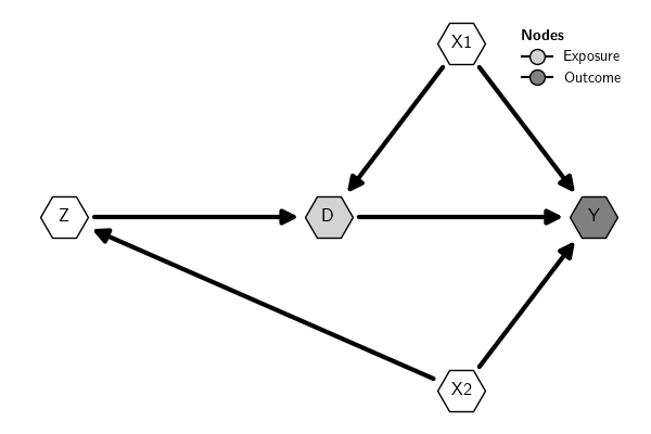
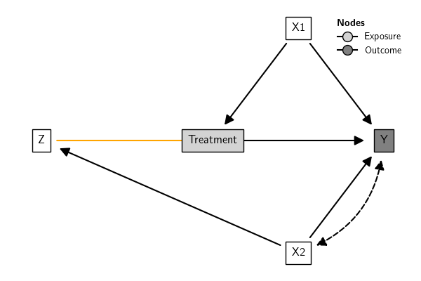
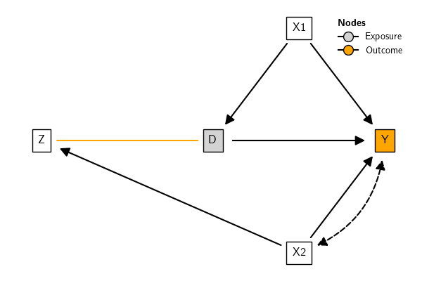
The function plot() plots the graph
using matplotlib and networkx in the background. The position of the
nodes can be set using a dictionary; otherwise, the positions are
calculated automatically. If the type of nodes (Exposure, Outcome,
.etc) are set (see Creating DAGs), by default the plot
includes a legend with the node types.
There are many options to customize the visual elements of the plot. They can be customized individually (see Graph attributes) or by using styles (see Graph styles). Check also the plot() documentation for a comprehensive list of options.
Here is a basic example:
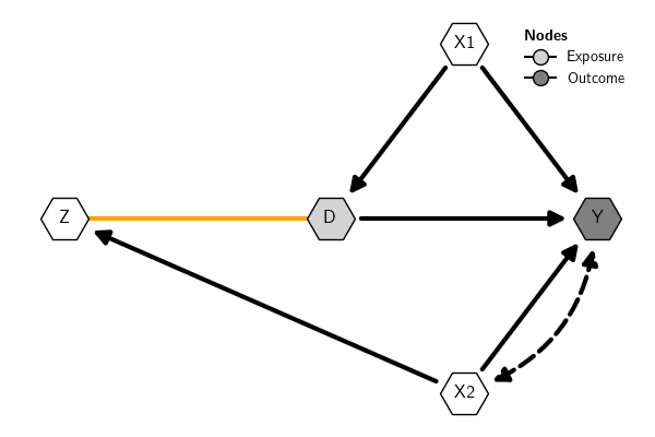
Bidirected edges are represented by default in the plot with dashed curved lines. In the context of causal inference with DAGs, by convention these arrows (often called "arcs") indicate a latent or unobserved common cause between the variables connected by the bidirected arrow. Alternatively, these variables can be included explicitly when creating the DAG.
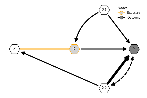
Undirected edges, on the other hand, in the context of causal inference with DAGs, are used to represent the skeleton of the DAG or observationally equivalent edges. That is, they are edges whose direction cannot be decided inferentially using observational data unless other parametric assumptions are adopted.
Here is an example (the example is just for illustration; the types of edges have no meaning in the example):
Graph Attributes
Style for nodes and edges
Nodes and edges can be styled individually, by type, or altogether. See plot() for more options and examples. Here is an example:
Labels for nodes and edges
It is possible to use labels for nodes and edges. Labels accept LaTeX mathematical expressions. For instance, to use subscripts for some variables, we can set the labels as follows:
Graph Styles
Overview
It is possible to change the visual attributes of nodes and edges individually (see Graph attributes) or using graph styles. The styles are dictionaries that define the attributes of the graph objects displayed in the plot.
The causalinf module provides built-in DAG styles, which can be extend
to create custom styles. There are two ways to use graph styles:
- Set a style locally for a specific plot using the argument
graph_styleof the functionplot() - Set a style globally using the argument
graph_styleof the functionset_options()
See examples in Built-in styles and Custom styles.
Built-in Styles
The function get_styles() shows the built-in styles available. If the
argument which is provided with the name of a built-in style, the
function returns a dictionary with the attributes of the corresponding
style. If which='current', it returns the current global style.
To see the style dictionary, use the 'which' argument with the name of a built-in style.
Built-in styles available:
- default
- rectangle
- pearl
Use which='current' to get the current global style.
Here is the default style dictionary:
{'edges': {'edge_arc': {'bidirected': -0.33, 'directed': 0, 'undirected': 0},
           'edge_color': {'bidirected': 'black',
                          'directed': 'black',
                          'undirected': 'orange'},
           'edge_head_size': {'bidirected': 20,
                              'directed': 20,
                              'undirected': 0},
           'edge_head_style': {'bidirected': '<|-|>',
                               'directed': None,
                               'undirected': '-'},
           'edge_label_alpha': {'bidirected': 1,
                                'directed': 1,
                                'undirected': 1},
           'edge_label_color': {'bidirected': 'black',
                                'directed': 'black',
                                'undirected': 'black'},
           'edge_label_color_background': {'bidirected': None,
                                           'directed': None,
                                           'undirected': None},
           'edge_label_color_border': {'bidirected': None,
                                       'directed': None,
                                       'undirected': None},
           'edge_label_position': {'bidirected': 0.5,
                                   'directed': 0.5,
                                   'undirected': 0.5},
           'edge_label_rotate': {'bidirected': True,
                                 'directed': True,
                                 'undirected': True},
           'edge_label_size': {'bidirected': 13,
                               'directed': 13,
                               'undirected': 13},
           'edge_linewidth': {'bidirected': 1.5,
                              'directed': 1.5,
                              'undirected': 1.5},
           'edge_margin_head': {'bidirected': 20,
                                'directed': 20,
                                'undirected': 0},
           'edge_margin_tail': {'bidirected': 20,
                                'directed': 20,
                                'undirected': 0},
           'edge_style': {'bidirected': 'dashed',
                          'directed': 'solid',
                          'undirected': 'solid'}},
 'nodes': {'Exposure': {'node_border_color': 'black',
                        'node_border_style': '-',
                        'node_border_width': 1,
                        'node_color': 'lightgray',
                        'node_label_box': False,
                        'node_label_box_margin': 0.5,
                        'node_label_box_style': 'square',
                        'node_label_color': 'black',
                        'node_label_fontsize': 12,
                        'node_label_fontweight': 'normal',
                        'node_shape': 'o',
                        'node_size': 1000},
           'Latent': {'node_border_color': 'black',
                      'node_border_style': '--',
                      'node_border_width': 1,
                      'node_color': 'white',
                      'node_label_box': False,
                      'node_label_box_margin': 0.5,
                      'node_label_box_style': 'square',
                      'node_label_color': 'black',
                      'node_label_fontsize': 12,
                      'node_label_fontweight': 'normal',
                      'node_shape': 'o',
                      'node_size': 1000},
           'Observed': {'node_border_color': 'black',
                        'node_border_style': '-',
                        'node_border_width': 1,
                        'node_color': 'white',
                        'node_label_box': False,
                        'node_label_box_margin': 0.5,
                        'node_label_box_style': 'square',
                        'node_label_color': 'black',
                        'node_label_fontsize': 12,
                        'node_label_fontweight': 'normal',
                        'node_shape': 'o',
                        'node_size': 1000},
           'Outcome': {'node_border_color': 'black',
                       'node_border_style': '-',
                       'node_border_width': 1,
                       'node_color': 'gray',
                       'node_label_box': False,
                       'node_label_box_margin': 0.5,
                       'node_label_box_style': 'square',
                       'node_label_color': 'black',
                       'node_label_fontsize': 12,
                       'node_label_fontweight': 'normal',
                       'node_shape': 'o',
                       'node_size': 1000}}}
Here is an example:
By default, plots use a built-in style called 'default'. Here is how the default style look like:

Retangular style gives more space for labels (see also Node style):
The "pearl" style uses the design adopted in Pearl
(2009). The position of the node label needs to
be adjusted manually. The label positions can be adjusted in block using
a float or individually using a dictionary. For instance,
node_label_adj_y={"Z":.1} adjusts only the y position of node Z,
while node_label_adj_y=.1 adjusts it for all nodes.
Styles can be set locally using the argument graph_style of the
function plot() or globally using the argument graph_style of the
function set_options(). Local options always overwrite the global
options for the current plot.
Here are examples illustrating how to use the built-in styles. This will use whatever style is currently set as the global option:

This will set the 'rectangle' built-in style globally, that is, for all plots unless the option is changed again:
This will use the 'default' built-in style locally; that is, only for the current plot (this option always overwrites the global style for the current plot):

In sum:
Custom Style
It is possible to extend the existing built-in styles (see Built-in
Styles) to create custom styles. This is done
using the function make_style(). The argument baseline of that
function informs which built-in style will be extended. By default, it
extends the 'default' style. The first argument new_style of that
function must be a dictionary with keys containing the names of the
visual properties of the graph to be set in the custom style. The
acceptable keys are those that match the names in the dictionary with
the built-in styles. See more details in the documentation
here.
Here is an example to extend the default built-in style. The default
style dictionary is (all built-in styles use the same keys):
{'edges': {'edge_arc': {'bidirected': -0.33, 'directed': 0, 'undirected': 0},
           'edge_color': {'bidirected': 'black',
                          'directed': 'black',
                          'undirected': 'orange'},
           'edge_head_size': {'bidirected': 20,
                              'directed': 20,
                              'undirected': 0},
           'edge_head_style': {'bidirected': '<|-|>',
                               'directed': None,
                               'undirected': '-'},
           'edge_label_alpha': {'bidirected': 1,
                                'directed': 1,
                                'undirected': 1},
           'edge_label_color': {'bidirected': 'black',
                                'directed': 'black',
                                'undirected': 'black'},
           'edge_label_color_background': {'bidirected': None,
                                           'directed': None,
                                           'undirected': None},
           'edge_label_color_border': {'bidirected': None,
                                       'directed': None,
                                       'undirected': None},
           'edge_label_position': {'bidirected': 0.5,
                                   'directed': 0.5,
                                   'undirected': 0.5},
           'edge_label_rotate': {'bidirected': True,
                                 'directed': True,
                                 'undirected': True},
           'edge_label_size': {'bidirected': 13,
                               'directed': 13,
                               'undirected': 13},
           'edge_linewidth': {'bidirected': 1.5,
                              'directed': 1.5,
                              'undirected': 1.5},
           'edge_margin_head': {'bidirected': 20,
                                'directed': 20,
                                'undirected': 0},
           'edge_margin_tail': {'bidirected': 20,
                                'directed': 20,
                                'undirected': 0},
           'edge_style': {'bidirected': 'dashed',
                          'directed': 'solid',
                          'undirected': 'solid'}},
 'nodes': {'Exposure': {'node_border_color': 'black',
                        'node_border_style': '-',
                        'node_border_width': 1,
                        'node_color': 'lightgray',
                        'node_label_box': False,
                        'node_label_box_margin': 0.5,
                        'node_label_box_style': 'square',
                        'node_label_color': 'black',
                        'node_label_fontsize': 12,
                        'node_label_fontweight': 'normal',
                        'node_shape': 'o',
                        'node_size': 1000},
           'Latent': {'node_border_color': 'black',
                      'node_border_style': '--',
                      'node_border_width': 1,
                      'node_color': 'white',
                      'node_label_box': False,
                      'node_label_box_margin': 0.5,
                      'node_label_box_style': 'square',
                      'node_label_color': 'black',
                      'node_label_fontsize': 12,
                      'node_label_fontweight': 'normal',
                      'node_shape': 'o',
                      'node_size': 1000},
           'Observed': {'node_border_color': 'black',
                        'node_border_style': '-',
                        'node_border_width': 1,
                        'node_color': 'white',
                        'node_label_box': False,
                        'node_label_box_margin': 0.5,
                        'node_label_box_style': 'square',
                        'node_label_color': 'black',
                        'node_label_fontsize': 12,
                        'node_label_fontweight': 'normal',
                        'node_shape': 'o',
                        'node_size': 1000},
           'Outcome': {'node_border_color': 'black',
                       'node_border_style': '-',
                       'node_border_width': 1,
                       'node_color': 'gray',
                       'node_label_box': False,
                       'node_label_box_margin': 0.5,
                       'node_label_box_style': 'square',
                       'node_label_color': 'black',
                       'node_label_fontsize': 12,
                       'node_label_fontweight': 'normal',
                       'node_shape': 'o',
                       'node_size': 1000}}}
Here are three new custom styles, two based on the 'default' built-in
style and one based on the 'rectangle' built-in style:
To create the graph to use the styles:
The new styles can be used either locally or globally. This sets the
style1 globally:

This uses the style2 locally:
The same for style3:
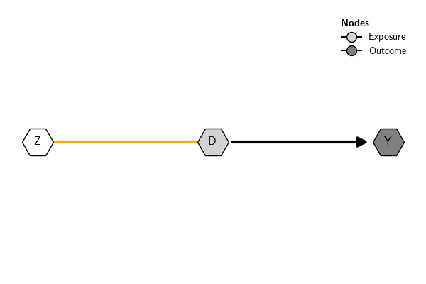
Plot sub-DAG
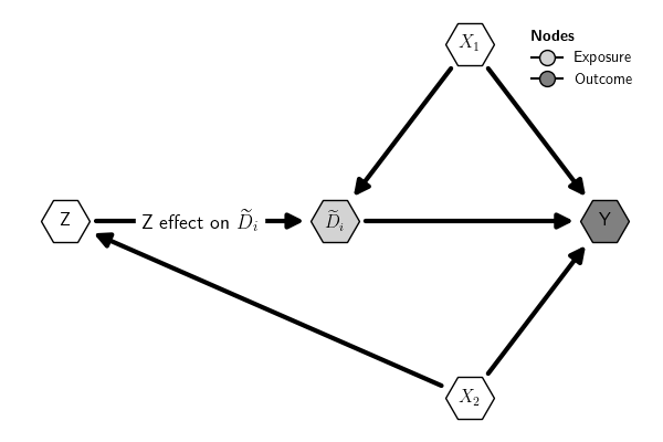
It is possible to plot a sub-DAG by selecting the subset of nodes or edges to plot.

Plot only nodes Z, D, and Y:
References
- Pearl, J. (2009). Causality: Models, Reasoning and Inference. : Cambridge University Press.